


If your Reels are good but the views are low, your covers might be the problem. A boring or messy cover can kill clicks before your video even has a chance to play.
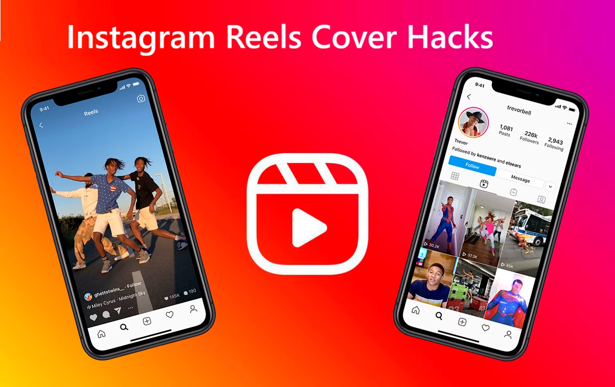
Your Reel cover is the small thumbnail that shows before someone taps. It appears in the Reels feed, your profile grid, and Explore. In simple terms, your Instagram Reels cover is your ad for the video. If the ad is weak, people scroll past, even if the content is amazing.
In 2025, more creators are posting than ever, and attention spans keep shrinking. The good news is that small tweaks to your cover text, layout, color, and style can bring big gains in views and followers. You do not need to be a designer to do it.
This guide will walk through easy, tested hacks so you can make Reels covers that get more taps, even if you are just starting.
Why Your Instagram Reels Cover Matters More Than You Think
People decide to tap or scroll in a split second. That choice often has nothing to do with your actual video. It starts with your cover.
Think of your Reel cover like a mini YouTube thumbnail. On YouTube, creators spend hours testing thumbnails because they know the thumbnail controls clicks. Reels work the same way, just faster and smaller on a phone screen.
Your cover shows up in a few key places:
- In the Reels feed, while people are swiping
- On your profile grid with all your other posts
- In the Reels tab on your profile
- On the Explore page for some users
If your cover is clear, bold, and easy to read, people understand what they will get at a glance. That tiny moment can be the difference between 500 views and 50,000.
In 2025, creators are using brighter colors, bigger text, and close-up images because the competition is heavy. Instagram pushes content that gets quick engagement. The faster people tap and stay watching, the more Instagram wants to show your Reel to others.
So your cover:
- Helps get that first tap
- Sets the expectation for what the video is about
- Makes your grid look professional and trustworthy
If someone opens your profile and sees a clean grid with strong covers, they are more likely to think, “This account is worth following.”
How Instagram Reels covers affect clicks and the algorithm
Instagram does not “read” your cover and reward you just for good design. Instead, it watches what people do after they see your Reel.
Here are the main signals that matter:
- Tap-through rate: How many people tap your Reel after seeing it
- Watch time: How long they stay watching
- Engagement: Likes, comments, shares, and saves
A strong cover grabs attention and makes people tap. Once they tap, your content and hook keep them watching. When more people tap and stay, Instagram reads that as a positive signal. Then it shows your Reel to even more people.
So the cause and effect look like this:
Better cover → More taps → More watch time and engagement → More reach
You are not changing the algorithm directly. You are changing how people react to your video, which is what the algorithm cares about. For more details on how this works in 2025, you can see how experts break down the Instagram Reels algorithm and engagement signals.
Where your Reel cover shows up and why that placement matters
Your cover appears in a few key spots, and each one has a job.
- Reels feed
This is where people swipe quickly. Your cover has about half a second to win a tap. Clear text, a strong face, or a bold image can stop the scroll. - Profile grid
Your main grid is like your storefront. Many people decide to follow based on how this page looks. Matching covers with simple text can make your whole grid feel clean and pro. - Reels tab on your profile
This is where binge-watchers go. When all your covers follow a similar style, they are easier to scan. People can quickly pick which Reel fits what they want right now. - Explore page
If Instagram pushes your content to Explore, your cover is competing with many other posts. A bright, high-contrast thumbnail with clear text has a much better chance of winning that tap.
Think of your Reels covers as part of your brand. They are not a throwaway frame. They are tiny billboards that run for you all day.
Design Basics: Make Instagram Reels Covers That Pop At A Glance
Good Reels follow a few simple rules. You do not need design skills, just a clear plan.
In 2025, the best covers are:
- Clear
- High contrast
- Easy to read on a small screen
- Focused on one main idea
Instagram displays the cover at around 420 x 654 pixels, but the full Reel size is 1080 x 1920. Design for the full size, but keep the important stuff in the center so it does not get cut off.
Your goal is simple. In one second, a stranger should know what they get if they tap.
Use clear, bold text that tells viewers exactly what they get
Your cover text is not a title for a book. It is more like a label on a snack: short, direct, and tempting.
Good examples:
- “Beginner Ab Workout”
- “3 Photo Hacks”
- “Easy 10 Minute Dinner”
- “How To Pose Solo”
- “Viral Hook Ideas”
Weak examples:
- “Watch This!!”
- “New Reel”
- “Monday Thoughts”
- “You Will Not Believe This”
Use benefit-based text that tells people what they gain. Fewer words are better. Aim for 2 to 5 words if you can.
Bold, thick fonts work best on mobile. Sans-serif fonts or clean handwritten styles are popular in 2025 because they are easy to read at a glance. Avoid super-thin or fancy script fonts for your main words.
Text should add clarity, not clutter. If your image is already telling the story, keep the text simple, like “Step By Step” or “Before / After”.
Pick high contrast colors so your Reel cover stands out
High contrast means your text and background do not blend. Think dark text on a light background, or light text on a dark background.
Easy color pair ideas:
- White text on a dark blue, black, or deep purple background
- Black text on a light beige, cream, or pastel background
- Neon accents on a muted background for small details
Use your brand colors if you have them. For example, if your brand uses teal and coral, build your covers around those colors. Over time, people will recognize your videos in the feed.
Bright colors usually work well in the Reels feed, but avoid harsh combinations that hurt the eyes, like bright red behind neon green. The key is readable, not painful.
Test a few color styles for a week or two. Notice which ones pull more views and saves.
Place your subject and text in the safe center area
Instagram often crops from the center when showing your cover in the grid, feed, or Reels tab. Icons like the play button and your username can cover the corners.
Think about a “safe zone” in the middle third of the frame. That is where your main subject and keywords should live.
Simple layout tip:
- Put your face or main object in the center
- Place the text near the face, but not over the eyes
- Keep the top and bottom edges clean so cropping does not cut off your message
Tools like Canva and many phone editors have guides that help you mark this center area. Use those guides so your cover looks good in every view.
Use simple backgrounds so your message is not lost
Busy backgrounds confuse the eye. If there are too many objects, colors, or people in the frame, your text and subject get lost.
Clean options:
- Plain color background
- Slightly blurred photo of a room or street
- One simple scene, like a kitchen counter or desk
You can also dim the background a bit and put white or bright text on top. This helps the viewer lock onto the message instantly.
Simple backgrounds also make your whole grid look cleaner. That makes your profile feel more pro and easier to scan.
Pro Cover Hacks: Easy Tricks That Boost Reels Clicks Fast
Once you understand the basics, you can add a few fast tricks that top creators use. These do not take much time but can raise your click rate very quickly.
For more advanced Reels tips and trends, you can also study roundups like Instagram Reels hacks creators are using in 2025, then apply the parts that fit your style.
Use faces, eye contact, and emotion to stop the scroll
Humans are drawn to faces. A clear face with emotion often beats a pretty background or random object.
Tips for using faces on covers:
- Use a close-up or mid-shot, not a tiny person far away
- Look at the camera to create a feeling of direct eye contact
- Match the expression to the content
Examples:
- Surprise or shock for “before and after” Reels
- Focused or serious look for tutorials or money tips
- Happy or relaxed for lifestyle and wellness content
Faces feel familiar and safe, so people trust them more. That tiny feeling of trust can turn into a tap.
Add curiosity with strong hooks and numbers on the cover
Curiosity is powerful when you use it honestly. A good hook makes people think, “I want to know this.”
Strong hooks you can put on the cover:
- “3 Secrets To Viral Reels”
- “Stop Doing This In Your Makeup Routine”
- “Before You Post, Do This”
- “Do Not Make This Editing Mistake”
- “The 10 Minute Trick I Use Daily”
Numbers, words like “secrets,” and “before / after” phrases pull people in. Just make sure your Reel actually delivers on the promise.
Match your cover hook with the first 3 seconds of your video. If your cover says “3 Secrets To Viral Reels,” start the video with “Here are the 3 Reels secrets I use every week.” That way, viewers feel satisfied, not tricked.
Use templates and editing tools to save time and stay consistent
You do not need to design every cover from scratch. Pick 1 to 3 templates and reuse them.
Your template can lock in:
- Font style and size
- Brand colors
- Text placement
- Logo or small username label
Tools like Canva, CapCut, or Instagram’s own editor are simple to use. Many have Reels cover presets ready to go. Reusing templates lets you batch content faster. You only swap the photo and change the text for each new Reel.
Consistent templates also help your profile grid look organized. When people see the same style again and again, they learn to spot your content in the feed.
If you want to repurpose your own Reels across platforms, you might need clean files without logos. A guide like Download Instagram Reels Without Watermark Using Free Tools can help you keep your covers and clips looking sharp when you reuse them.
Refresh old high-value Reels with better covers.
You do not always need new footage to get more views. Some of your older Reels may be great, but hidden behind a weak cover.
Here is a simple way to revive them:
- Open your Reels insights and find videos with good watch time or strong saves, but low total plays.
- Create a new, clearer cover with strong text and a better frame or photo.
- Update the cover on Instagram.
- Track the views for the next week.
Many creators see old Reels start to grow again after a cover refresh. This is an easy win when you are short on filming time.
Match your cover style to your niche and target audience
Your best cover style depends on who you are trying to reach.
Examples:
- Entertainment or comedy: Bright colors, big text, playful fonts
- Wellness or mental health: Soft colors, simple fonts, calming images
- Business or finance: Clean fonts, balanced color, professional photos
- Beauty and fashion: Close-up faces, soft backgrounds, stylish text
Think about your ideal viewer. What other accounts do they follow? What kind of covers do those accounts use? Use that as a starting point, then add your own twist.
The goal is for your covers to feel like they belong in your niche, while still standing out in the feed.
Optimize, Test, and Track: How To Know Which Reels Actually Work
Good Reels creators treat their covers like mini experiments. They test ideas, check the numbers, and adjust.
You do not need to be a data nerd. You just need a simple system.
Use Instagram insights to spot high-performing covers
Instagram gives you built-in stats for every Reel.
To check them:
- Go to your profile.
- Open a Reel.
- Tap “View insights.”
Focus on:
- Plays (views): How many times the Reel was watched
- Likes, comments, shares, saves: How people reacted
- Reach: How many unique accounts saw it
Compare Reels that are about the same topic or format. Look for patterns:
- Do covers with yellow backgrounds get more views?
- Do close-up face covers beat wide shots?
- Does big text at the top work better than text in the middle?
Write these notes in a simple doc or on your phone. Over time, you will see what your audience likes most.
Run simple A/B tests without overthinking it
You can test different cover ideas with basic A/B tests.
Practical ways to do this:
- Post two similar Reels on different days, each with a different cover style
- Change only one thing at a time, such as font style, color, or zoom level
- Wait a few days to see which one gets more plays and saves
Do not stress about perfect tests. The point is to learn faster, not to be perfect. If one style clearly wins, use it more often.
Create a quick checklist for every Reel cover you post
A short checklist saves time and keeps your quality steady. Before you publish a Reel, run through something like this:
- Is the text short and clear?
- Can I read it on a small phone screen?
- Is the main face or object inside the center safe zone?
- Are the colors high contrast, not muddy?
- Can someone understand the message in one second?
- Does the cover match what happens in the first 3 seconds?
- Does it fit my niche and overall grid style?
Save this checklist in your notes app. Use it until these steps feel natural.
Conclusion: Small Reels Cover Tweaks, Big Click Gains
Strong Instagram Reels covers are not fancy art pieces. They are simple tools that help people decide to tap. Clear text, strong visuals, high contrast colors, and safe center placement can lift your clicks and growth faster than most tiny tweaks.
In 2025, the accounts that stand out are the ones that treat covers as part of their brand, not an afterthought. You do not need to apply every tip at once. Pick two or three hacks from this guide, like using close-up faces, cleaner text, and simple backgrounds, and test them on your next few Reels.
Watch how your views, saves, and follows change over the next month. Then keep the parts that work and drop the ones that do not.
Your next viral Reel might already be sitting in your drafts. Give it a cover that deserves the views.